


Bedroom Wall Decor: A Simple Look with Colorful Posters

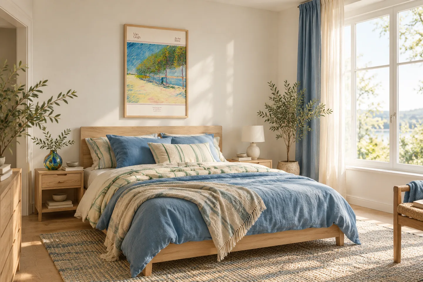
You don’t have to stick to just beige and white tones for bedroom wall decor. Vibrant colors like blue, coral, or yellow can also create a balanced look in a simple room. What matters is how the bedroom poster you choose complements your bedding, furniture, and patterns.
1. Start with your bedding’s color palette
Use a color found in your bedding, bedspread, or pillow as a starting point when choosing a poster. For example, you could pair a blue pillow with an art poster that features shades of blue and coral. The colors don’t have to be exact matches; a shared tone is enough to tie different pieces together. Leaving large surfaces neutral and using vibrant colors in just a few details makes it easier to maintain the room’s cohesion.
2. Don’t let the patterns clash
If you’re using striped or floral bedding, try a simpler design with large blocks of color. Solid-colored textiles, on the other hand, can be paired with a more dynamic abstract poster. Instead of repeating small motifs across every surface, highlight one piece and keep the others more subdued. This way, the patterns complement each other rather than competing.
3. Consider a wall beyond the headboard
A poster doesn’t necessarily have to be hung above the headboard. The wall across from or next to the bed might be a better spot to view the artwork more comfortably in your daily life. Don’t make your decision based solely on how it looks from the doorway; also consider the placement when you’re sitting on the bed or getting ready in the room. The impact of a visual that’s hidden behind a door, closet, or curtain may be diminished.
4. Match the frame to the style of the furniture
In a room with light wood furniture, a slim, light wood frame creates a natural sense of continuity. If there are black metal accents, a slim black option could also be considered. Instead of a thick, ornate frame, start with a simple one that lets the poster’s colors shine. Keeping only a few items on the nightstand also helps the wall art stand out more clearly.
To compare different colors and compositions, take a look at the Abstract Posters collection. When making your selection, consider not only the poster itself but also the textiles and furniture that surround it.